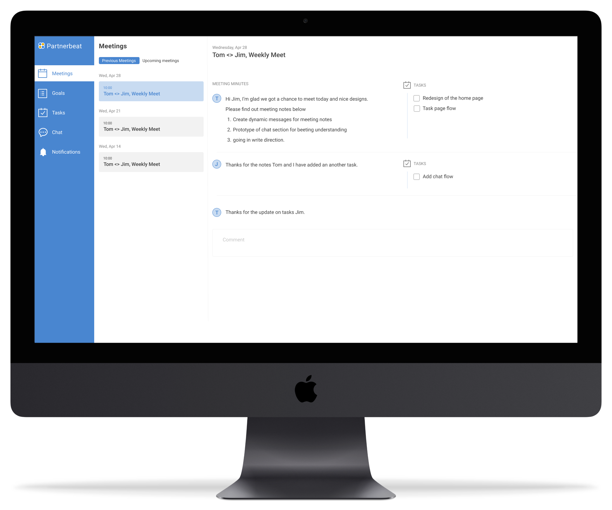
Partnerbeat is a B2B startup providing CRM services that help companies manage business relationships in one place. Unlike traditional CRMs, Partnerbeat emphasizes external collaboration through Shared Sites—dedicated spaces for Customer Success Managers (CSMs), Account Managers, and Partner Managers to seamlessly work with clients outside their company.


I contributed to two major design initiatives that redefined how users collaborate through Shared Sites:

  1. Redesigned Shared Site Web Experience – streamlined workflows, improved onboarding, and increased engagement.
  2. Designed End-to-End Mobile Shared Site – created a responsive mobile web experience to extend usage beyond desktops.

My role

UX Research

UI & Visual Design

Prototyping & High-Fidelity Mockups

Team: Myself + Stakeholder (Susan Totten, ex-Uber PM)Duration: 2 projects, each ~3 weeksTools: Figma, Adobe Illustrator

Challenge

Managing external relationships was fragmented. Users juggled multiple tools (emails, Slack, docs, meetings), with no single source of truth. Partnerbeat’s Shared Sites were intended to solve this, but adoption was low due to two issues:

  1. Web Version: Heavy setup, confusing onboarding, and unclear focus areas.
  2. Mobile Experience: 20% of users attempted access via mobile, but the site was unresponsive, leading to frustration and drop-off.

The core design questions were:

  • How might we make Shared Sites easy and intuitive to use for both internal managers and external partners?
  • How might we extend usage to mobile without building a full native app?

Impact

Designed the branding and logo for KEATS, which is now recognized as superhot and has contributed to building a global presence for the organization.


I helped KEATS USA transform their online presence into a platform that inspires trust, educates donors, and drives meaningful action — all while crafting a positive, illustration-led design language that stands out among non-profits.

Research & Insights

An extensive study of competitors like Hugo, Asana, monday.com showed me that Partnerbeat's shared site application was behind few aspects. Through our user interviews, it became evident that they were few pain points that need immediate attention

This led me to

User research findings


  • User Interviews: Identified pain points of CSMs (needing dynamic meeting notes and easy sharing) and Partner Managers (needing clarity on priorities).
  • Personas:
    • Tom (CSM): Maintains ~40 accounts. Wants to keep partners engaged seamlessly.
    • Jim & Alice (Partner Managers): Need quick clarity on action items, notes, and notifications—often while away from their desks.

Competitive analysis findings


  • Studied Gainsight, ChurnZero, Monday.com, Asana. Found mobile access and contextual onboarding were strong differentiators.

Design process

Initiative 1: Web Shared Site Redesign


Problems:

  • CSMs defaulted back to email because setup was too heavy.
  • Partners didn’t know where to focus upon onboarding.


Solutions:

  • Dynamic Meeting Notes: Inline editing, comments, linked tasks & goals, historical context.
  • Focused Landing Page: Clear overview of “what needs my attention today” with tasks, goals, and chat threads surfaced upfront.


Impact:

  • Reduced friction for CSMs to share and collaborate directly in Partnerbeat.
  • Improved partner adoption with a clear, simplified onboarding experience.

Initiative 2: Mobile Shared Site Experience


Problems:

  • Mobile access was broken and unresponsive.
  • Users couldn’t access notes, tasks, or chats when away from their desktops.


Solutions:

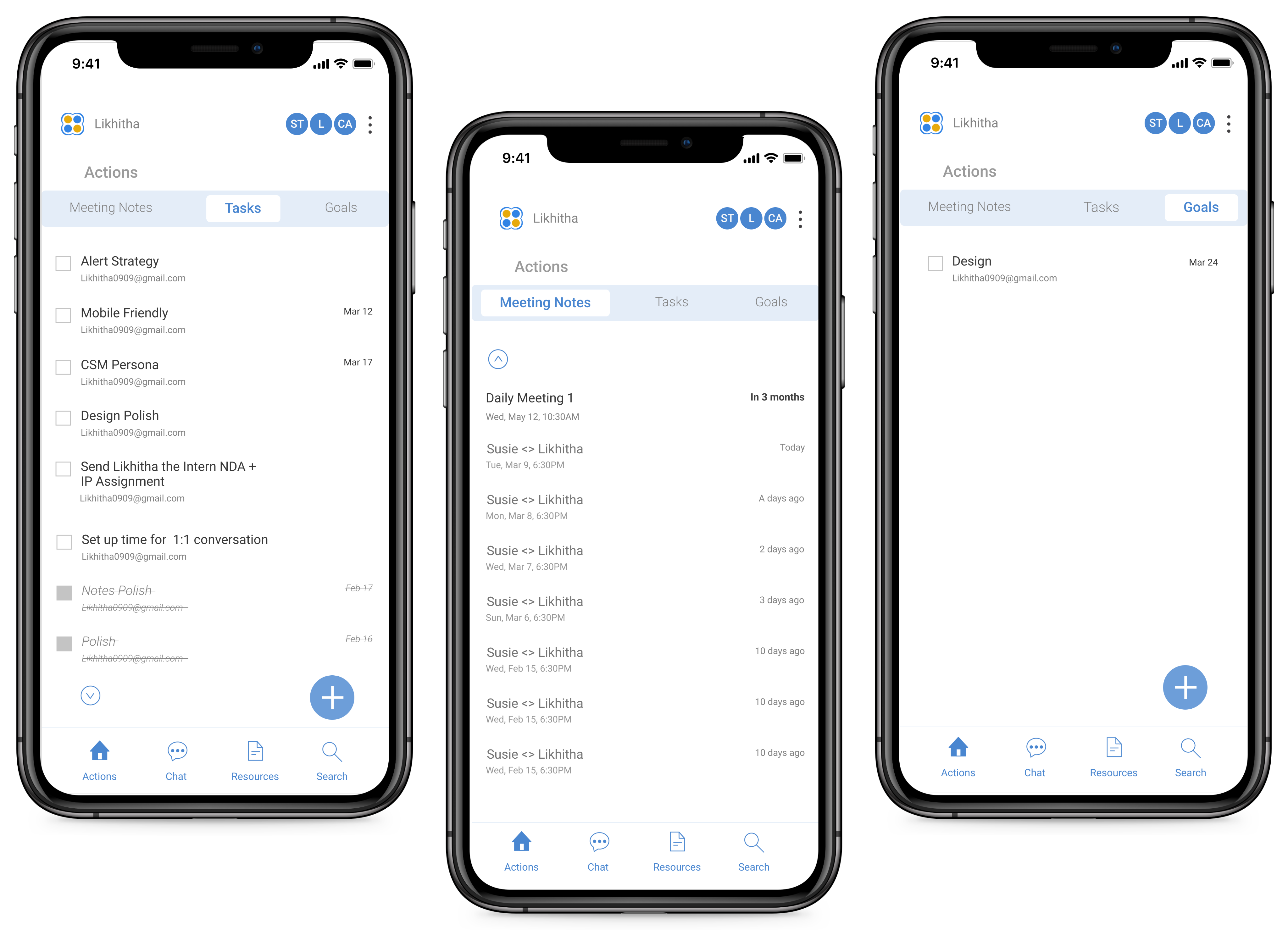
  • Mobile-first Design: Created a responsive mobile web app (not native) with full Shared Site functionality.
  • Landing Page as Meeting Notes: Prioritized upcoming meetings & notes since that was the dominant mobile use case.
  • Bottom Navigation: For easy thumb reach + swipe gestures across core features (Notes, Tasks, Chat, Notifications, Resources).
  • Notifications System: Two-tab design ("Mentioned" vs "All") to balance urgency with history.


Impact:

  • Extended Partnerbeat’s usability to mobile without requiring a native app.
  • Gave Partner Managers flexibility to check notes, update tasks, and chat while on the go.
  • Increased potential overall adoption by meeting users in their real contexts (travel, internal meetings, lunch breaks).

Results

  • Validated Designs: Both initiatives were tested with CSMs and Partner Managers and received strong feedback.
  • In Development: Redesigns are now being built.
  • Business Value: By addressing major adoption blockers, these designs positioned Partnerbeat to retain users inside the product instead of losing them to email/Slack.

Learnings

  • Navigating startup ambiguity and shifting priorities while still delivering usable outcomes.
  • Fighting for good UX under strict technical constraints.
  • Defining true MVPs that balance feasibility and usability.
  • Scaling patterns consistently across web and mobile ecosystems.

Stakeholders feedback

“Likhitha has more thoughtfulness, empathy, and focus than designers with many years of experience. She asks deep questions to get to the bottom of whatever user pain point we're trying to solve. One of my favorite things about Likhitha is that she is an entrepreneur which comes through in her work - she understands what it's like to create a business, the need to create true value for people, plus she has a lot of grit and gets things done! She isn't afraid to tackle big, hairy projects and massive user workflows with very little context.”

Let’s connect

Get in touch for any full-time opportunities or just say hello

likhitha0909@gmail.com