KEATS USA is a Non-Profit Organization started in 2020 whose mission is to add value to vulnerable individuals of the society and improve quality of their life by serving in the fields of Education, Empowerment, and the Environment. I designed their Web application in a way to convey emotions to audience through Visual design and Illustrations (all the illustrations were created by me) .
My Role
UX Research, UI & Visual Design, Illustrator, Prototyping, High-Fidelity Mockups.
Team
I ( UX Designer) and Praneeth( Developer).
Tools
Adobe XD, Adobe Illustrator, Adobe Photoshop.
Results
Shipped UI Design of Shared site in 3 months.

The Solution
The Challenge
To design an improved service that KEATS USA provides its users and in turn, bring about the following:
-
Improve people's understanding and awareness about donation that can make a significant impact on an individual's life.
-
Increase contributions on an individual level to existing programs of KEATS USA.
Background
KEATS USA is a Non-Profit Organization started in 2020 whose mission is to add value to vulnerable individuals of the society and improve quality of life by serving in the fields of Education, Empowerment, and the Environment. KEATS is its parent organization in India working since 2014, they have been actively working in building schools in rural areas, building skill development centers, and educating about health and sanitation conditions
What does KEATS Aims to do?
We analyzed KEATS, its parent organization, and its services, to establish the right problem to solve and the appropriate direction to take. We started with organizational analysis.
To understand KEATS better, we used a framework adapted from The Golden Circle by Simon Sinek, in order to learn:
-
Why KEATS exists — i.e. their mission
-
How they achieve their mission
-
What are their means
WHY - KEATS mission is to add value to vulnerable individuals of the society and improve their quality of life by targeting Education, Environment, and Empowerment.
HOW -They get huge donations from its member. It aims to get more volunteers and donors by educating people about their programs.
WHAT - Run campaigns.
UX Research
Conducted User Interviews
For our solution to be User-Centric and to gain a better understanding of how we could more effectively address this problem, we conducted a series of user interviews. Questions we asked included:
-
Tell us more about what social issues you care about and why?
-
How do you access information about social issues you want to be involved in?
-
What factors influence you the most when deciding which social issues/organizations you want to be involved with?
-
What stops you from being more involved with organizations?
Uncovering the barriers to involvement
After surveying 15 participants and conducting 5 user interviews, we were able to discover several major trends that we needed to address in the next phase of our design process.
Some of the major pain points we identified included:
-
People wanted to validate that organizations were trustworthy and aligned with their values.
-
People felt they didn’t have enough educational resources to contribute.
-
People wanted to be more involved but were unsure where to start.
-
People felt saddened looking at images of helpless children or adults on web applications of non-profit organizations, hence do not prefer donating through such platforms.
Competitive Analysis
To gain inspiration and identify best practices for our website redesign, we conducted a competitor analysis. We began by looking at the websites of several other non-profit organizations including Human Rights watch, World food program, and Feeding America.
One common feature we identified across these websites was the placement of the donate button in order to emphasize it as the main call to action. This was an important design pattern to consider in order to make it easier and more efficient for users to get involved and donate.

Another common design pattern we observed was that each non-profit prominently displayed their mission statement at the beginning of their homepage. This was an important method to effectively communicate each non-profit’s mission to the user and help them better understand what each organization does.
On the donate page, we noticed that many non-profits had pre-determined donation amounts in order to make the donation process easier and more efficient for users.

Solution
We believed we can address the problems by designing an improved service through a user-centric website, where our users can easily digest relevant and credible information about KEATS USA. We will design the website to provide individuals with more meaningful information about donation, it's missions and programs, and easy ways to get involved (volunteer). This would help establish trust and confidence in KEATS USA, increase awareness, and ultimately empower individuals to get involved.
Design
Initial Sketches
Once I organized all my research and defined my solution, I began to explore potential designs for the website. To start this process, I quickly made sketches of the Home page and our impact which is a design practice to help translate our thoughts into tangible ideas and better visualize our problem. This allowed us to quickly explore several concepts for the website layout as illustrated by the quick sketches below. We then tested these with 3 participants to validate whether these solutions addressed both the user and business needs.

Wireframing
After I defined the core functionalities that I needed to include in our solution, I created quick, low-fidelity wireframes. Using these wireframes, I was able to conduct usability testing with 4 participants. This allowed me to gather some crucial feedback to help me decide what to include in the final experience before jumping into the next iteration of our design.


Findings
Overall users had an easy time using the website, I just needed to address a few small issues with the navigation labeling and placement of the page titles. I completed a few rounds of iterations based on testing and feedback to ensure the wireframes included everything I needed. Once the functionality of my design was finalized, I moved on to designing the UI.
Final Design
Addressing Pain Point 1 : Is the Organization trustworthy?
We wanted to ensure that the user would feel confident and have trust in KEATS USA so we made sure to incorporate this aspect into several different features throughout the website including:
-
“Prominently displayed mission statement on the Home page and Our Impact pages.
-
"About Us” page to give users a deeper understanding of KEATS USA.
-
"Our Impact” page showcasing facts and statistics about the impact the programs have made in the community.
Home Page
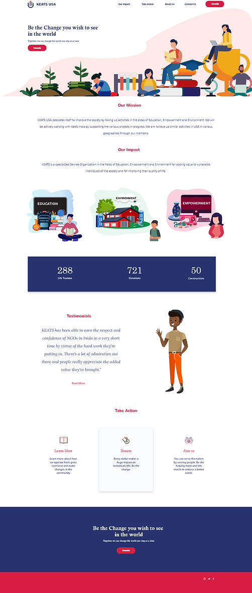
About Us

Our Impact Pages
Environment Page

Empowerment Page

Addressing Pain Point 2 : No Education resources.
we wanted to expand the focus beyond businesses and organizations to be more inclusive of individuals. In order to do so, it was important that we provided more meaningful and easily accessible information to users about the issues at hand.
One of the ways we accomplished this was by designing a “Take Action” page. Users could go could visit this page to inform themselves more about donations, as well as easy ways they can get involved to make an impact.
Take Action

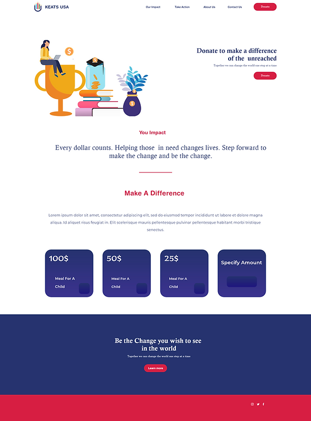
Addressing Pain Point 3 : Do not know where to start?
We addressed this issue by designing a Donate button as main call to action (CTA) further highlighted it by red color. By making the donate button easily visible, it would make it easier and more encouraging for users to contribute — bridging both the organization and user needs. We also wanted to make the money donation process more simple for users that might not have a lot of time to get more involved, but still want to contribute. We redesigned the money donation page to include suggested amounts individuals could donate. Additionally, we made sure to provide a compelling and short reason why they should donate and the impact their donation would have.
Donate Page
Addressing Pain Point 4 : Alternatives to images?
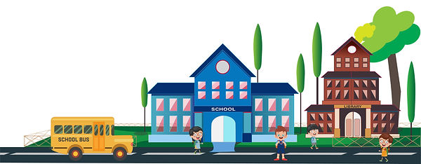
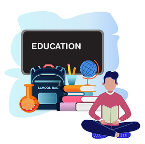
We tried capture the emotional quotient of our users through Illustrations rather than images all across website. Each Illustration depicted the impact KEATS has created in its respective fields.


Next Steps: Looking at the Bigger picture
Moving forward with this project, I’d like to start looking at the bigger picture of how to get more individual donations.This includes exploring different offline methods to raise awareness for donations and ultimately drive traffic to the KEATS USA website.
My Learnings
This project was a monumental learning experience for me in so many ways. I feel like overall our team accomplished an credible amount of work considering. I personally learned a lot about the process, collaboration, and working with non-profits. I also learned quite a bit about myself.
I’d like to highlight two things I think will have the most impact on my ongoing career and creative process:
Collaboration is the key
While I do have experience working within interdisciplinary teams and leading creative direction through past jobs, this was my first time working with fellow UX designers, which brought on its own set of challenges. I had to learn to be more aware and open to constructive critique, as well as learn how to adapt to other designers’ habits and methods. I believe this project has allowed me to develop new collaboration skills that will be helpful for other projects in the future.
Importance of Research
This project was a lot more research heavy. I saw this as an opportunity to strengthen my research skills and get more involved in the process of learning about our users and their needs. Some of the methods and situations which I encountered for the first time were eye-opening and will be helpful to use moving forward in my design career.